Showing posts with label Fabriano Venezia Journal. Show all posts

Sunday

Rain, Rain


It was pouring rain on Tuesday night and Wednesday. Rainy days are the perfect times to pull out those little antique shop items, paint flowers, clean the studio, or make some progress on a large painting. Since I was waiting for company to arrive, the little antique shop items won out. I picked up these three charming, cobalt blue vases over the summer and have been looking forward to their sketchbook debut ever since! Although they are actually blue, I didn't happen to have a blue pen inked up at the time, so these were sketched with Noodler's Purple Wampum, one of my favorite washable inks. I used a waterbrush over the ink lines to create the washes.

This was done in a 6x9" Fabriano Venezia journal across the two page spread. I only have two pages left in this journal --- the first and the last. Finishing up those pages will close a pretty big chapter in my life, since I started this book on February 1, 2011. I left the first page blank to title it when I was done. It's time for me to start thinking of a title!

Wednesday

Four Sketches of the Hudson River

Click image for a larger view.

I have a large oil painting commission to do of a scene along the Hudson. The other day, I grabbed my sketchbook and watercolors and headed down to the location to do some preliminary sketches to discuss with the client, before proceeding on the large piece. It was freezing cold along the river early in the morning, but I know from experience that the light on the cliffs of the Palisades leaves early. By the time the sun is well overhead, they are all in shadow. I bundled up with my warmest coat, hat, scarf and mittens, and worked as fast as I could! Word from the client: "I love them all!" So, I'll be combining some elements for the final painting.

I taped off the rectangles to do the sketches while I was out on location. That kept my borders clean. I already knew what the dimensions of the large painting would be, so I stuck to those proportions. Once I got home, I drew in the borders around each sketch with a calligraphy pen, and used acrylic paints on the outside border, mixing colors to match the inside border's ink color. When finished, I painted a layer of Golden Interference Gold Fluid Acrylic, diluted with gloss medium, over the outer brown border. Although it doesn't show in the photo, there is a beautifully subtle gold sheen on the outside edge of the page.

Sunday

Golden Iridescent and Interference Acrylics

As I said a few days ago, I've been playing with some shimmery colors lately and test driving how I can use them most effectively. I did this chart to see what would happen layering assorted Golden Interference colors over some of the Golden Iridescents. I also made one row black, and left one the white of the paper, to see the color shift from light to dark (which is way more dramatic than I thought it would be!) There's some glare on the page, but I used this photo because it's when the light hits that you can see some additional effects. As you can see, the interference colors on black are really beautiful! Now I'll have to explore using these with other dark colors too.


Saturday

The Wedding Day

My sister made these charming favors herself for her wedding guests. There was one at each place setting, with delicious chocolates and almonds inside. She let me bring home all the empty pots that guests left on the tables, so I can use them to hold paint and water in the studio! I really like having this memory of her special day, and every time I fill up a little pot with water, I think of her.

After the luncheon reception, my husband and I were able to go for a four mile walk on the beach and catch the sunset over the Gulf, before meeting up with everybody for a late dinner. There were tons of shells, and I collected an assortment to sketch in our hotel room. These are a few of the ones we picked up that day.

Friday

Traveling to Florida

My sister got married last weekend in Florida, so my husband and I flew down for the wedding. I didn't get much of a chance to sketch this trip, but managed a few pages. This one was on the way down, when I grabbed a few minutes while waiting for the bus to take us to the airport, and again in the waiting area before boarding the plane. We took off 20 minutes early, so that waiting period was a lot shorter than I thought it would be!

Tuesday

A Special Gift


This statue has waited a long time to make it into my sketchbook! I really enjoyed using a monochromatic approach. It seemed to suit the subject and my mood at the time!

Monday

Sketching the Lynx at the Newburgh NY Waterfront


Today I went to sketch with my friend Virginia along the Hudson River at the Newburgh Waterfront. My plan was to sketch the cafes along the boardwalk and views of the Hudson Highlands. I was pleasantly surprised to find this gorgeous ship, Lynx, docked there to model for me. The angle of the masts is really striking. As usual, I didn't remember to get a photo while at my sketching location, but I got this one later from closer to my car, so the angle is a bit different. Still, you can get an idea of the beautiful scene there. I thought probably nobody would believe the angle of the masts without a photo! It's amazing how slanted they are.

The sketch of the ship and docks was done directly with ink and a black Sakura brush pen. Then I used Noodler's Lexington Gray in a Lami Safari "F" for the rigging, and a Platinum Preppy 0.5 filled with J. Herbin Gris Nuage for the mountains in the background. Even when working in monochrome, it's nice to have some value options at your disposal! I was especially glad to have the Gris Nuage along for those soft mountains in the distance, made even softer today by the atmospheric conditions. Using the light gray ink for the mountains allowed the ship stand out in the foreground, while providing a nice backdrop shape.


Sunday

Finders Keepers


Every so often, I find a little something special when out walking. These glass bottles and turkey feather I found while walking the dog. The bottles will make nice wildflower vases come spring. The wide-mouthed one will serve as a brush holder in the meantime. I have an old pitcher that I've been filling with turkey feathers whenever I find a nice one. This particular feather is very downy --- as if it belonged to a young bird.

These were all painted with watercolors and Escoda round sable brushes sizes 10 and 2.  The writing was done with Noodler's La Reine Mauve (in their "Eternal Inks") line, using a Platinum Preppy eyedropper-converted fountain pen. 

Friday

My new watercolor palette and layout


I got this beautiful, new Schminke watercolor palette! It folds up nice and small, and is pretty easy to travel with. I decided that I wanted a setup with more colors that was still easy to cart around. It's a little larger than the palette I was using before, and I had to make a new sketchboard to accommodate the extra width. It came as a three row palette, but my husband trimmed a bit off the metal plate base so I could slide it up and squeeze in an additional row of half pans.

I also changed my color layout. It looks a little haphazard, but there is a method to my madness! In the top two rows, I put the opaque colors on the left, the transparents in the middle, and the earth colors over to the right. It's really helped to avoid mistakes between colors that look similar in the pans, but have completely different properties. The bottom row contains seasonal colors that will rotate, or exotic hues that I only use occasionally, colors I'm test driving, or colors that are easily mistaken for something else. (Quinacridone Gold is in that row because when it was in the yellow row, it looked so similar to Winsor Newton Raw Umber in the pans that I kept diving into it at the worst possible moments!)

The painted color chart was done so that I'd be able to remember what was in the set in terms of both color and brand. Some colors are completely different in different brands. That seems to be especially true with Raw Sienna and Raw Umber! I realized that if I wanted my mixes to be consistent, I'd have to be consistent in brands too, or at least test drive mixes in advance when trying new brands, so I can avoid some surprises when out painting on location.

Saturday

Study of an Old Maple Tree Trunk


This was done out in my yard, using a 6B pencil in my Fabriano Venezia book. This old Maple has so much character from every angle. I did another drawing of it on Stonehenge, using a light and a dark on a colored ground. You can see that on this post on my Hudson Valley Painter website. Yesterday, I did yet another sketch of it from a different angle in watercolor. I'll be posting that one tomorrow on http://hudsonvalleypainter.com

Thursday

My Favorite Dessert Recipe


RiverWinds Gallery is putting together a cookbook of favorite desserts by their artists and the gallery owners. I contributed a recipe and did this sketch of ingredients for the book. The book should be out in a couple of months, and then you'll all be able to make my favorite recipe! Stay tuned....

Every once in awhile I start to feel like I just might be getting the hang of this watercolor thing! This was so much fun to paint, and I love the brilliance of the colors.

Notice how much straighter my writing is, now that I have those journaling templates? Those were a great find!

Tuesday

Reviews of La Reine Mauve ink and Journaling Templates


I got some great new art supplies to add to my journaling arsenal last week! I found this set of journaling templates by Karen Foster Designs that are going to enable me to finally write straight! They come held together by a key chain and offer a couple of different line width options. The widest is about 4", and I do wish there was a 5" and a 6" also, but I can just slide the template over to extend the lines.

In addition to Noodler's Kung Te-Cheng ink, which I reviewed yesterday, I also got their La Reine Mauve, Zhivago, and a couple of sample bottles of the new Blue Nose Bear. The brush pen and fountain pen shown above came with the Kung Te-Cheng ink --- a little bonus for having to purchase such a large bottle of it. I'm glad I love that one so much, because I don't think I'm ever going to run out of it!

The purple writing and drawing on this page was done with La Reine Mauve. How much do I love this ink? Let me count the ways! I purchased this to be a more vibrant purple version of the Kung Te-Cheng, and it does not disappoint! The ink has nice flow properties, and vibrant as it is, once down, it stays put. This is in the Noodler's line of bulletproof, eternal inks, so I don't have to worry about water spills or using watercolors over a drawing. And what a great color! La Reine Mauve only comes in a 1 oz bottle, so it's a bit on the pricey side, but worth every penny for its high performance and beauty.

More ink reviews coming soon! If you'd like these posts delivered to your email, you can just enter your email address in the box on the right sidebar.

Monday

Remnants and Review of Noodler's Kung Te-Cheng Ink


I picked these flowers from around my property before the Hurricane Irene hit, and painted them out on the patio after the storm departed. Even the mug is a remnant from a former time; it was left in a cabinet by previous owners of the house!

I got a delivery of some new inks last week, and used this opportunity to break out my brand new bottle of Noodler's Kung Te-Cheng. I used it for both the journal writing and the sketch above. For awhile, I was most interested in inks that would wash for my ink and wash sketches. But lately I've been yearning for more colors that will stay put. They are more useful in combination with watercolors, since they don't bleed and dirty the color. I've also been thinking that if I were to ever spill water on one of my journals by accident, all the text would bleed if the ink wasn't waterproof. I tried a small sample of Kung Te-Cheng six months or so ago, and loved the color, which is midway between blue and violet, and muted enough to not be overpowering. Perhaps the biggest surprise came when I did lightfastness tests of 13 inks. Many of them faded a lot within just a few weeks, but Kung Te-Cheng hung tough and easily outperformed all the others in terms of lightfastness. So, I knew it was just a matter of time before I treated myself to a bottle! It's only available in a 4.5oz size, but comes with an eyedropper-converted Platinum Preppy fountain pen and a brush pen to use with the ink! You can get it from one of my favorite suppliers, Goulet Pen Company. If you don't want to order this huge bottle without trying it first, you can order a sample of it. More ink reviews are on the way in the very near future!

Sunday

Hiking to North Point


I'm still trying to catch up on photographing sketches and paintings and getting them posted! It's been hard to get that done on vacation, but it's quickly approaching "Back to Work" time! This watercolor sketch was done on a hike to North Point in the Catskill Mountains. North Point offers 270 degree views facing south, east, and north. This is the south-facing view, which overlooks North South Lake and the old Catskill Mountain House site. We were hoping for better visibility, but it was quite overcast that day. The trail was wet, rocky and slippery almost the entire way. Next time I'll definitely go when the trail is dry, but of course we were rewarded by the fabulous location at the top.

Thursday

Barns at Riga Farm


Riga Farm Paintout
Once again, LHVPAP member Melissa Fischer hosted a paintout at her parents' beautiful farm in Millerton, New York. There is always so much to paint here. Vic is on vacation and also joined us with his camera. I didn't know how long we'd end up staying and wanted to capture as many scenes as I could, so I decided to just do sketches today. I also wanted to test drive my new sketching setup in the field. (It worked out great.)

This sketch is pen and ink with watercolors. The ink in the sketch is Noodler's Lexington Gray in a Lamy Safari "F" fountain pen. The ink used for the writing is Noodler's Purple Wampum (a fabulous muted, very dark violet) in a Platinum Preppy 0.5 fountain pen. Watercolors were Winsor Newton and Holbein.

Tuesday

North South Lake Hike and Karen's Dahlias


Text:

Hiking around North South Lake
Vic stopped to make a phone call, so I did this two minute sketch while waiting. (upper left) The campsites all have these nice stone fireplace-grills, and some have beautiful views of the lake. We've heard there are a lot of bear issues this year, and that they're even climbing into cars at the campsites if visitors leave their car windows open. Everybody is being told to keep all food in a closed cooler inside their locked vehicles!


Karen's Dahlias
Karen brought me these beautiful dahlias from her garden when she and her husband came over for dinner last night. She said she knew it was going to rain and I'd be looking for something to paint indoors. She was right, and these are the perfect subject for a gloomy day!

Monday

Falls at Moore's Bridge


When you drive on Route 23a as it starts to wind through Kaaterskill Clove, you never suspect that hidden underneath the second bridge is this beautiful waterfall. You can see a tiny bit of the bridge structure at the top right of the photo above. Kaaterskill Creek runs along colorful red sandstone ledges here, churning and spraying as it tumbles down the rocks and forms transparent pools at the bottom.


Sunday

Falls along Kaaterskill Creek


My husband and I went exploring along Kaaterskill Creek. I brought watercolors and my Fabriano Venezia sketchbook. We came upon a very popular swimming spot along the creek with some small waterfalls and striking rock formations. It was a great place to spend a little time. I found an ideal place to sit on a rock and take in the scene.

Here is the sketch after I got it home and did the date stamp and writing:

Thursday

Chairs with a Modified Cinquain poem

In case you thought I fell off the face of the earth due to my lack of painting and sketching posts, fear not! My husband is on vacation for the month of August, and we've been having a great time visiting all sorts of places that I plan to go back to with paints! Some things I'm just behind on photographing and posting, due to being busy having so much fun.....Like this one!


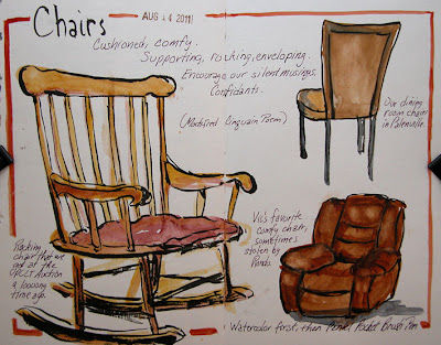
You can click this sketch for a larger, clearer view. These are a few favorite chairs sketched from life one evening at home. I did something a little different for me this time; I painted directly with watercolor (no line work), then went back and drew with a Pentel Pocket Brush Pen. I did this for two reasons. First of all, I didn't want the ink to run when I did the watercolor work, and the ink in this pen is not waterproof. Secondly, I didn't want to "paint inside the lines", so doing the line work after I thought would allow for a looser and more interesting look. I'm not quite sure how it worked out, but I think I'll be experimenting more with this approach.

The Modified Cinquain form has five lines that follow the following guidelines:
Line 1 contains a one word subject, which is also the title of the poem
Line 2 contains two adjectives
Line 3 contains three -ing words or other words conveying action
Line 4 contains four words that express feelings or emotion
Line 5 contains a one word summary of the subject

So, my poem (in case you can't read it in the photo) is all about...

Chairs.
Cushioned, comfy,
Supporting, rocking, enveloping.
Encourage our silent musings.
Confidants.

Initially I was thinking of doing this series of "Poetic Sketches" in a single sketchbook. However, with all this work in different books, I am feeling scattered and I'm afraid I will never finish any of them! So, I am returning to working mostly in one book at a time, with the goal of finishing up this Fabriano Venezia book that I started last February.