Showing posts with label watercolor and ink. Show all posts

Saturday

Prompt List for Holidays in Ink (plus other media) 2022-23


Here's the post that many have been eagerly awaiting....

THE PROMPT LIST!

If you haven't yet seen the post with the dates and other details of the Holidays in Ink Challenge, you can find it here.  Please read that first, as it is not repeated here.

The prompts below are an Inspiration Library for when you're stumped for what to draw, or you can do them all, or do none of them. The prompts are meant to be combined in your sketches, not just used individually. Don't get overwhelmed by how many there are; combining them in sketches is part of the challenge. There is no requirement that you do the prompts. The real goal is to finish your sketchbook! 

I will do things a bit differently this year, and skip around in my book from day to day.  You can work on pages over multiple days, and/or multiple pages in one day. You do you. Pack the pages, and fill that book!

I've divided the prompts below into loose categories. Do them in whatever order you wish, according to how much time you have, what you feel like doing, or if you are traveling.

Sunday

Get Ready for Holidays in Ink (plus other media) 2022-23!


It's almost that time! You're invited to join me and a bunch of my friends for this fun, educational, and motivational, annual adventure. We'll combine inks with other media to complete a sketchbook during the holiday season. This post outlines what you need to know in order to play along.

DATES:

Monday, November 21, 2022 - Friday, January 6, 2023

GOAL:

Based on how quiet or hectic your personal holiday season is, select or make a sketchbook that you will easily be able to fill during those dates. When November 21 arrives, start your book. Use some ink. Incorporate other media if you wish. That's it!

SUGGESTIONS:

THE SKETCHBOOK

You do not have to complete a page a day, nor even a sketch every day. Well, of course you could. But I will not be doing that. Personally, I've opted to complete 36, two-page spreads during the 47 days of Holidays in Ink. I found a fabric with ravens in moonlight that I loved, turned it into bookcloth, and made my sketchbook a couple of weeks ago. 


Monday

De Atramentis Document Inks -- Lightfastness, Waterproofing, and Other Attributes


Results are in on the lightfastness tests I did of the full line of De Atramentis Document Inks!

You can see the results of the testing of the De Atramentis Document Inks in this post, as well as my comments regarding other attributes of those inks, which I've been exploring during and after the six months of testing. Below is a photo of all the ink swatches before half of each went into the window. It's a combination of the Document inks, some others that Brian Goulet sent me (from Goulet Pen Company), and some fountain pen, drawing, and calligraphy inks that I had here in the studio and wanted to test. This post will focus only on the De Atramentis Document Inks.


Sketchbook Video Flip Through -- Holidays in Ink Challenge


Happy New Year, everybody! I can't believe Holidays in Ink is over. I'm still mentally processing everything from this challenge. Here's a video tour of the sketchbook I created during the challenge.

A note about the figurative works: Except for the dancers in primary colors, they were done during weekly figure drawing Zoom sessions that I do with a few friends. We've been working from master paintings, allowing 20 minutes for each. The figures are therefore a bit more stylized than they would be if we'd been using photographs.

Holidays in Ink Week 5


I've been excited to have a go at the Black and White on Toned Paper prompt (Process #6). When working on a toned surface, I nearly always select a warm color or neutral  gray. This time, I decided to pick up the cool colors of sky and water, using a sheet of periwinkle-colored cardstock that has been living in the studio closet for several years. I'm loving the strong contrasts and power of these Notan style sketches. I used the paper color as my midtone value, adding just black and white for lights and darks. I definitely want to do more of these moving forward.

I made Sumi ink this week for the first time, using a Sumi ink stick and stone.

Holidays in Ink Week 4


I can't believe we're more than half way through this challenge, and heading into Week 4. If you're doing the challenge also, let me know in the comments how it's going. I'm glad there are still over two and a half weeks left, since I still have a lot of untapped prompts, and nearly 30 blank pages remaining in this sketchbook!

The sketch above, in bright, primary colors, was the result of several days spent mostly doing monochromatic work. I was DYING for some bright color at that point, so I pulled out my most saturated, brightest watercolors, and gifted myself with a fiesta day of color intensity. Normally I'd do a composite with several different poses, but I loved the image of this dancer, so I sketched the same pose several times, as if it were a dance company chorus, letting the colors mingle and the images float across the page from one to the next. The linework was added after the watercolor dried.

Holidays in Ink Week 3


The Holidays in Ink Challenge certainly got me out of my comfort zone this week. I had some new art adventures, discovered more about what inspires me, and had some flops and successes. Leave me a comment and let me know how it's going for you too! If you've posted your sketches somewhere, feel free to leave a link there too. If you haven't started this challenge yet, but would like to, you can read all about it and get the prompt lists (which are totally optional) at this link.

Day 7 involved a Process Prompt I knew I would put off forever if I could: Blind Contour drawing! But I was determined to tackle it. I had beautiful, fresh flowers to inspire me for the Flowers subject prompt, so that helped ease the pain. I did the sketch with a red Bic Cristal Xtra-Bold 1.6mm ballpoint pen (Amazon Affiliate Link), and then splashed some watercolor over it with a loose approach. (Image below.) Starting with the pen in the upper left hand corner and working across the page helped me guess where I was. I also tried to keep my hand still and work around a center point of the flower, then shift my hand over for the next bloom. I confess, I did peek just a few times to be sure I was filling the page! I don't think I've done blind contours since a figure drawing class 20 years ago, and it was more fun than I thought it would be. The inaccuracies gave me some interesting and unexpected shapes to work with. I like the red lines poking through the watercolor. These Bic Cristal pens are great for sketching, with their very wide ballpoints yielding lots of variation when wanted, and intense colors. At under $5 for a set of 24, the price is hard to beat for some favorite art tools during this challenge!

Saturday

Holidays in Ink Challenge 2020-21 -- Details and Prompt Lists


During the busy holiday season, I'll be taking this Holidays in Ink Challenge, enabling me to just sketch with pen and paper when the going gets tough! Come play along if your life gets as hectic as mine from Thanksgiving through New Year's Day, or if you'd like a challenge to push your artistic boundaries and inspire you. Many artists have asked me to include a list of prompts. As a result, I've decided to make two lists ("Subject Prompts" and "Process Prompts"), which are included below. It's posted well in advance of the start date, so you'll have time to gather whatever you need in materials or references to complete your personal challenge.

NITTY GRITTY DETAILS

Sunday

Holidays in Ink, Anyone?


Here in the northeastern United States, October is the month when we plein air painters flock outside to capture the very short burst of peak color in the landscape. It's a time I look forward to all year. Not only is it the best color we will get, but it's the last opportunity before colder temperatures drive us indoors. I've always lamented the fact that Inktober happens in October. I love working in ink, but it's the last thing I want to do in October. Every winter, I come up with a personal, motivational studio art project to expand my own horizons, and try to make the most of the days indoors. This year, from Thanksgiving until after New Year's Day, I'm going to do Holidays in InkYou're all invited to join me if you'd like an interesting art challenge around the holidays.  Here are the basic details:

Monday

Courtroom Sketches


I was sitting in on a court case today and had my first-ever opportunity to sketch in a courtroom.  I arrived a few minutes before the first case was called, so I did the quick sketch above to feel out the lay of the land and get my bearings. I used a Pentel Gray Aquash brush pen for all of my sketching today. The sketchbook is one of the new Zeta hardbound books from Stillman & Birn. Going right in with an ink-filled brush is really my favorite way to go about this kind of thing, especially on this smooth Zeta surface. The two facing pages of this spread had been slightly toned with a warm-colored watercolor wash several days previously. I laid in a bit of color after I got back home just to liven it up a little.

This was the Albany City Court building. I wouldn't have minded an entire day there just to sketch architectural elements. The hallways were filled with magnificent marble arches and a central winding marble stairway. This courtroom had exquisite woods with intricate carvings, which of course I didn't have time to render.


The proceedings got underway, and I got to experience at least a little bit of what courtroom artists are up against when they are trying to capture a scene amidst a cast of changing players. I have to say, it was really a lot of fun to do this, though I'm not sure I'd want to do it under the kinds of pressures that the courtroom artists endure. There are lots of things I'd plan differently the next time around, such as leaving spaces to put in figures that would move into various positions in the room, then pop them into those spots as the situations present themselves.

This second sketch was done over a blue wash, which was a little bit dark in terms of being able to present my light values. That's something I'll have to take into consideration next time, especially if I plan to use watercolor over it. I resorted to a little white gouache to reclaim some lights, like on the table tops. It also would have been nicer to work a larger size for this; however, I was trying to remain inconspicuous, so the double spread of a 5.5x8.5" book was perfect for a few minutes of stealth sketching.


Tuesday

New Product Review --- Introducing Stillman and Birn Zeta


If you're a fountain pen aficionado, sketch with ink and dip pens, love Pitt Brush pens, or the coverage you get with colored pencils on smooth paper, or mixed media on a plate-like surface of extra heavy-weight paper, you're going to adore this new Zeta paper from Stillman & Birn. Think of their fabulous Epsilon surface in a thicker, more opaque version, and you'll have a pretty good idea of what this paper is all about. When I first tried the Epsilon paper, I loved it so much that I wanted an even thicker version. Now it's here! Many thanks to Stillman & Birn for making my dream come true.

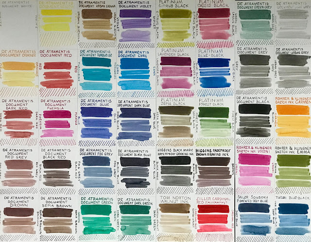
I was sent some 8.5x11" sheets of the Zeta by Stillman & Birn when it first came in from the mill in France. When I first saw and felt the Zeta paper, there seemed to be such a world of possibilities for media that would work well on it, that I didn't know where to begin. I wanted to do a sketch that would showcase the potential of this smooth, slick surface. I did a few sketches in watercolor and ink of flowers, pitchers, vases and fruit, and played with assorted inks and washes. Then I decided to sketch some of the materials I'd like to use on this paper, which became the inspiration for this particular sketch. I tossed some of my favorite pens, brushes, markers, crayons and pencils into a brightly colored little pot that I normally use for my painting water, and set out some paint tubes as foreground elements.I felt the colors in the setup were strong enough to carry a strongly colored ink. Noodler's Black Swan in Australian Roses is one of my favorites. It is not lightfast. It is not waterproof. But there is something magical about the color, so I keep a wonderful Sheaffer 100 loaded with this ink, and it is always with me. I like the way this ink weaves the color harmony of the sketch together. I started this sketch with a few pencil lines, then went right in with ink and did the drawing, working mostly front to back. I used a wet brush to create some wash effects with the ink in shadow areas, followed by the watercolor. The last step was putting in small ink details, like some of the writing on the paint tubes, which would have run if I'd done it earlier in the process. I accidentally did this sketch on the reverse side of my sheet of dark ink test swatches, which proved to be a testament to the high opacity of this paper; no ink lines showed through at all!

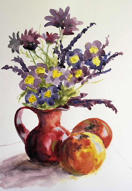
The way the internal and external sizing of the paper permits the paint pigment to lie on top of the page yields a wonderful brightness in the color. The pigment does not spread out and mix together like with traditional watercolor paper, so it does take some getting used to and adapting. I'm really looking forward to breaking out my gouache on this paper. I think it will be a great match. The sketch below was done with transparent watercolor and just a bit of white gouache toward the end for the lights. But actually, the sizing allows for pretty easy lifting of pigment, so I probably could have reclaimed those lights without adding white. This sketch is 8.5x11.


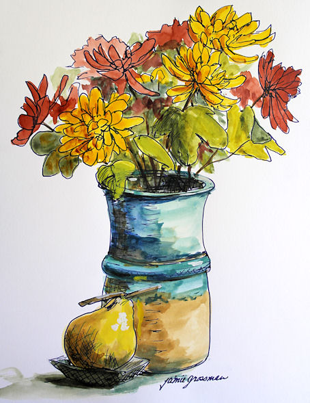
I also did a sketch with an ink that I know to generally be very waterproof. Since waterproof fountain pen inks are at least partially challenged by heavy sizing, I wanted to find out if Noodler's Kung Te-Cheng would run when I added watercolor. It's one of my favorite inks, and I wanted to be sure it would stay put on this paper, no matter what else I did to it. Well, as you can see, the ink did not run at all. The sketch below was done while visiting with my friend Gingie at RiverWinds Gallery in Beacon. They have so many beautiful displays there that it's a fun place to break out a sketchbook! This one is also 8.5x11"on the Zeta paper, using a Kaweco fountain pen with a broad nib and transparent watercolor.


There is so much more to explore with this paper. I can't wait to have it in sketchbook form. Finally there is an ink-friendly paper that does not show through to the other side at all, so there will be no ghosting of images when working front and back on the pages. If you enjoy working on smooth paper, this is definitely one to check out. I know I'll be going through a lot of it. If you would like to also read another artist's review of this paper, check out this post by Jeanne Powers-Forsyth.

Friday

Kaaterskill Falls from the Top

8.5x11" across a two page spread of a 5.5x8.5"
Stillman & Birn Beta Hardbound Sketchbook
Ink and Watercolor

On the way back from the Inspiration Point hike that I posted about yesterday, we detoured to the top of Kaaterskill Falls, where you can sit alongside Lake Creek just where it plunges over the 270 foot waterfall. There are dramatic distant vistas of the mountains from up there, plus beautiful rock outcroppings and intimate cascades. It was one of the favorite spots of the Hudson River School artists, and it's one of my favorites as well! They have done quite a bit of trail work there recently and the footing is vastly improved from the top of the mountain down to the top of the falls.

Thursday

Hike to Inspiration Point

8.5x11" across a two page spread in a 5.5x8.5"
Stillman & Birn Beta hardbound sketchbook
Ink and Watercolor

I went to Inspiration Point several times this past summer and fall. For some reason, it has beckoned me this year! The twisted birch tree on the left seems to end up being my sketching subject on the trips more often than not. I love the contrast in the trunk, and the way the backlit leaves light up against the mass of Kaaterskill High Peak behind them. The ink and watercolor were done on location. Once home, I added the border and lettering with a Pitt Big Brush Pen

Sunday

Hunter Mountain Fire Tower

Stillman & Birn 5.5x8.5" hardbound Beta sketchbook
Watercolors
Lamy Safari with EF nib and Noodler's Luxury Blue
Pitt Big Brush Pen (for page border only)

Text:
We took the easier route to the fire tower by riding the chair lift up to the Colonel's Chair, and then hiking the two miles uphill to the tower from there. The views from the tower were spectacular, though beter for experiencing than for painting. We were grateful for having made the decision to bring sweatshirts along! They were certainly needed on the chair lift ride up in the morning, as well as up on the tower, where the wind was brisk and chilly.

Once back down on firm ground, we sat on some rocks by the ranger's cabin and had peanut butter sandwiches, and I pulled out my paints to sketch the scene. The top of the tower was blocked off. We couldn't figure out why they would do that, but perhaps they were trying to discourage people from spending the night up there or making a mess.

As usual, the trip down was a lot easier than it was going up!

Tuesday

Expansion of the Hudson River School Art Trail


8.5x11" across a two page spread of a Stillman & Birn Alpha Hardbound sketchbook
Platinum Black Carbon Ink and Watercolor
Image can be clicked to enlarge

On June 2, the official announcement was made about the expansion of the Hudson River School Art Trail to include many new sites. Kevin Avery, from the Metropolitan Museum of Art, gave a wonderful lecture at the Thomas Cole National Historic Site about these official Art Trail locations as well as other spots where the Hudson River School Artists did some of their most famous work and their plein air studies. (Of course I couldn't resist sketching during the lecture.) Click here to read more about the Hudson River School Art Trail. You can download maps and information on the website.

Saturday

Waiting and Sketching at White Plains Airport

8.5x11" across a two page spread in a Stillman & Birn Alpha 5.5x8.5" Hardbound book
Noodler's Black Swan in Australian Roses ink in a Sheaffer 100 fountain pen
Ink blended with a waterbrush, then transparent watercolor added

It's times like this when I'm especially grateful to be an artist. You could leave me alone with a sketchbook and some art supplies and a few apples, and I'd be fine for days! The rest of the passengers didn't share my enthusiasm for a bit of extra sketching time though.

White Plains Airport is actually a pretty fun place to sketch, with large model aircraft hanging overhead in the tall space. The last time I flew out of here, the flight was cancelled, so I considered myself lucky that the plane was just delayed this time around. The trip itself was so busy that I didn't get an opportunity to sketch again until I returned home.

Sunday

Spring Flowers from My Garden

11x17" across a two page spread of a Stillman & Birn Epsilon Hardbound book
Watercolor and Pitt Big Brush Pens

Sometimes it's easier to tackle a single rectangle than to take on an entire two page spread, so I really enjoy setting up grids for various series of things I want to paint when I'm short on time. You can click the image above for a larger view of the sketch.

Here's my setup below, as I finished up the final section. I have a piece of Coroplast (corrugated plastic that is nearly weightless) to which I velcro my palette and clip on my palette cups. It extends under part of the book, which weights it down so it won't fall over. That leaves me hands free.

Thursday

When you're short on sketch time, make a grid!

11x17", across a two page spread in a Stillman & Birn 8.5x11" hardbound sketchbook
Watercolor, Pitt Brush Pens, Fountain Pens, or whatever else I had next to me at the time!
You can click this image to enlarge it. 

It's that time of year when after a winter of being indoors and mostly sketching, I can get out and return to my life as a plein air painter! I have not stopped sketching by any means, but my more finished work is now being done in paint or on separate sheets of rag paper. (You can always check in to see those on my other blog.) 

I feel it's very important to continue sketching, and not give that up when the going gets tough. One of the things I do when time gets tight is I make a grid and sketch a series over time. I have several grids going at any given time on different themes. I try to select themes that hone specific skills. This one was started a few weeks ago as a means of practicing elipses and symmetry. Whenever I had a morning without having to immediately dash off somewhere, I sketched my coffee mug. I sketched the last mug this morning. These were all done directly in ink, so warts and all, I had to live with whatever came out of the pens. 

I'm really enjoying this larger sketchbook, and it certainly presents great opportunities for gridded series! I have a few portrait grids going (32 portrait boxes across a  two page spread!) and some other subjects too. Way fun. Great practice. Quick to do. No excuses!

Sunday

Sketching at Melissa's House

Private Reserve Chocolat and Private Reserve Velvet Black Inks, mixed about 3:1 
in a Platinum Preppy fountain pen, and washed with a waterbrush.
A little watercolor
Stillman & Birn Epsilon 5.5x8.5" hardbound sketchbook

My friend Melissa invited a group of us over to her house to sketch on Friday. I was delighted to see that unlike mine, her amaryllis actually had a flower stalk on it --- with a bud! I knew I had to sketch that.

Since I recently found those deer jawbones to sketch, I also had to draw this deer skull that Melissa had, which seemed to be the remainder of the head!

Monday

Giraffes at the Bronx Zoo

Click image for a larger, clearer view
Pitt Pens and Watercolor
Background prepared in advance with diluted acrylic

At the end of the day, we wound up at the giraffe house. They are indoors for the winter in a very comfortable and inviting space. The lighting was good and visibility excellent. I really fell in love with sketching these beautiful, graceful creatures. Aside from the ballet-like way in which they move, they have the most expressive faces, which became the focus of my attention. I want to go back and spend more time with them very soon.